La Tierna
A new era for a luxury San Antonio apartment community.
REBRAND
Before it was La Tierna, it was Presidium Chase Hill.
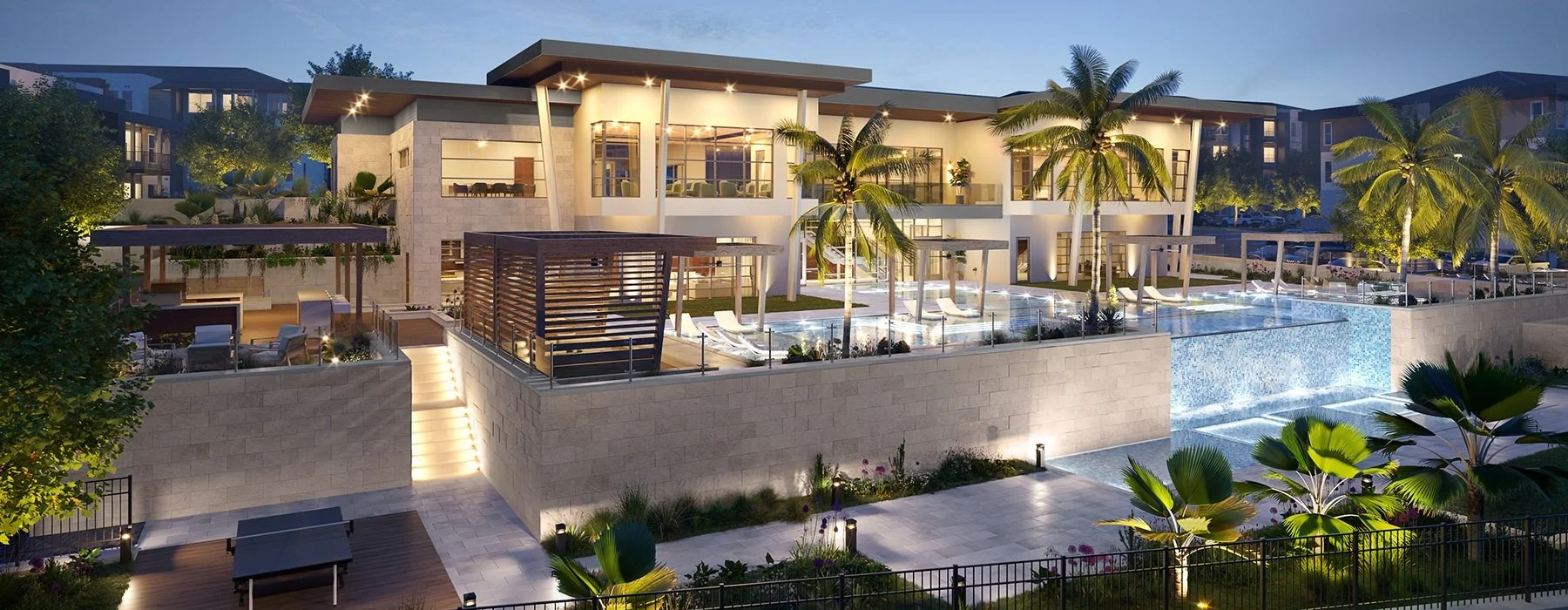
This community offers modern, resort-inspired living to its residents in North San Antonio, Texas. With a stunning collection of one-, two-, and three-bedroom apartment residences and picturesque views, this property is at the center of Texas Hill Country beauty.
Phase 1: Naming
When Presidium Chase Hill joined the RPM portfolio, it needed a rebrand within 180 days due to legal restrictions on using a parent brand name. As the lead designer for this rebrand, I conducted a discovery call with the RPM Operations and Marketing Teams, along with the client, to discuss the property. After a thorough questionnaire with the client, our team began brainstorming names that would suit the community.
Following an extensive naming process that included rigorous vetting and client presentations of the name options, we established the new name: La Tierna, which means "the tender" in Spanish. A tender home exudes a gentle and affectionate atmosphere — a haven of comfort where residents can find solace and joy. Our inspiration came from San Antonio's Spanish influence and the property's proximity to La Cantera, a nearby luxury resort.
Phase 2A: Logo Identity Development
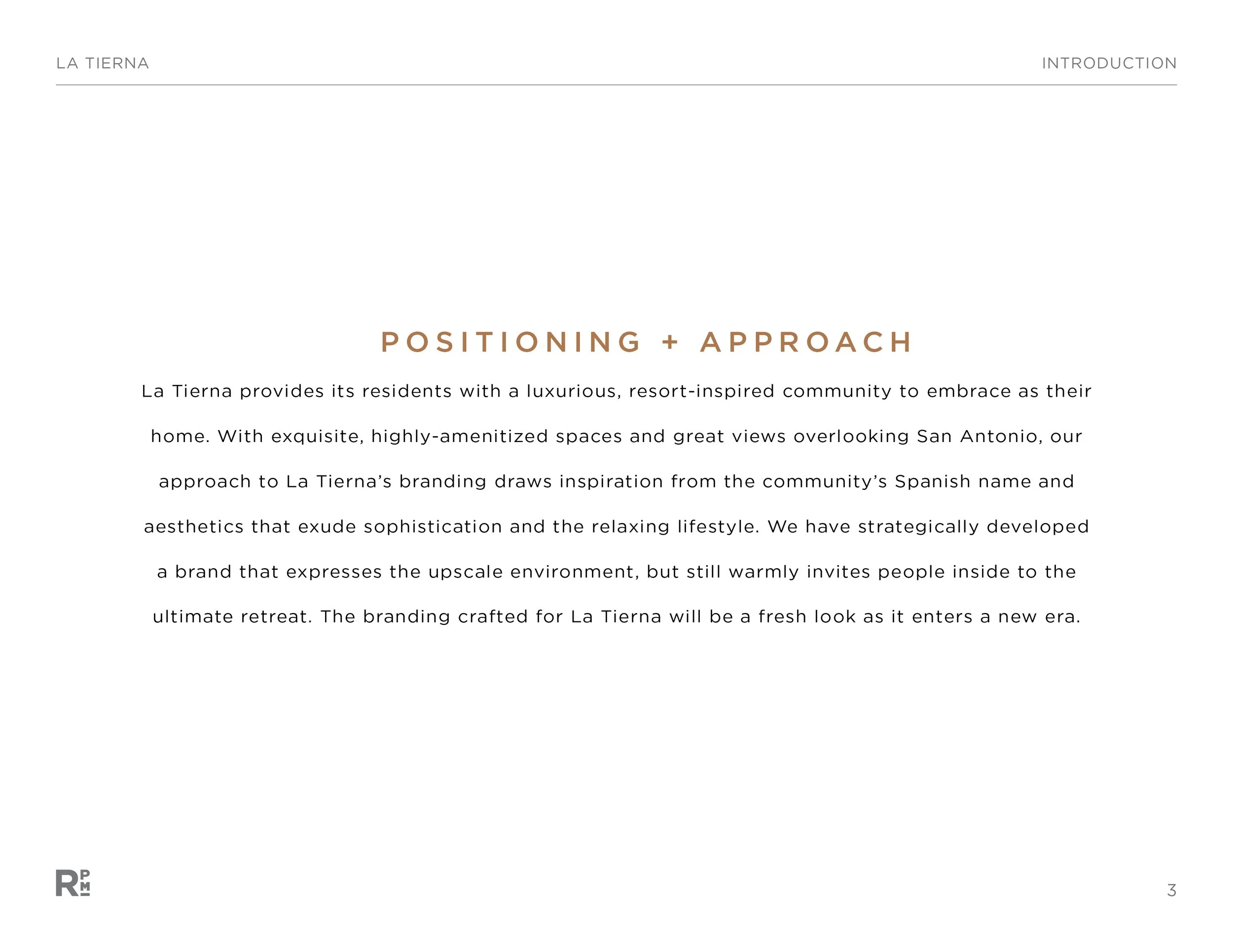
As the design lead, my approach to La Tierna's branding was inspired by the community's Spanish name and aesthetics, which evoke sophistication and a relaxing lifestyle for residents. The Creative Team strategically developed three brand identity concepts that captured the upscale environment while also warmly inviting people into the ultimate retreat.
Concept 1: Home Sweet Paradise
Lavish / Inviting / Relaxed
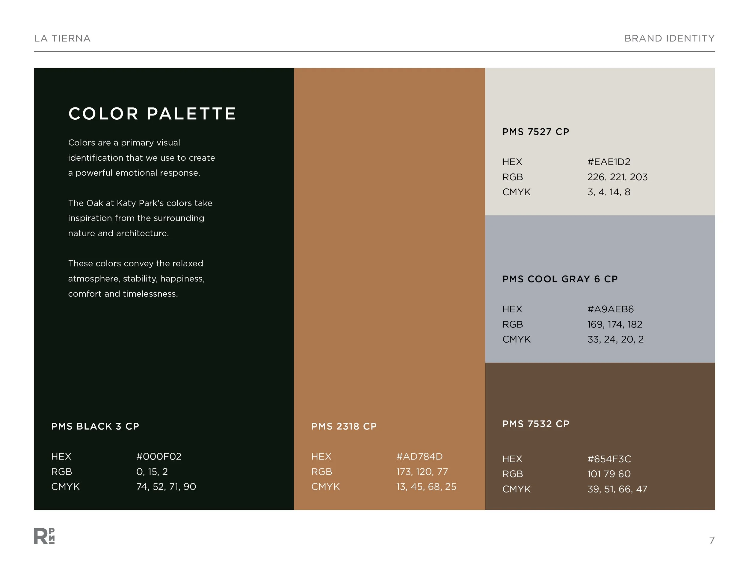
The script logo conveys elegance, style, and character – just like how one's signature is unique and possesses personality. The color palette is a combination of contrasting neutrals supported by warm, wood tones to echo the wood features found in the leasing office and resident spaces.
Concept 2: Hermosa Vista
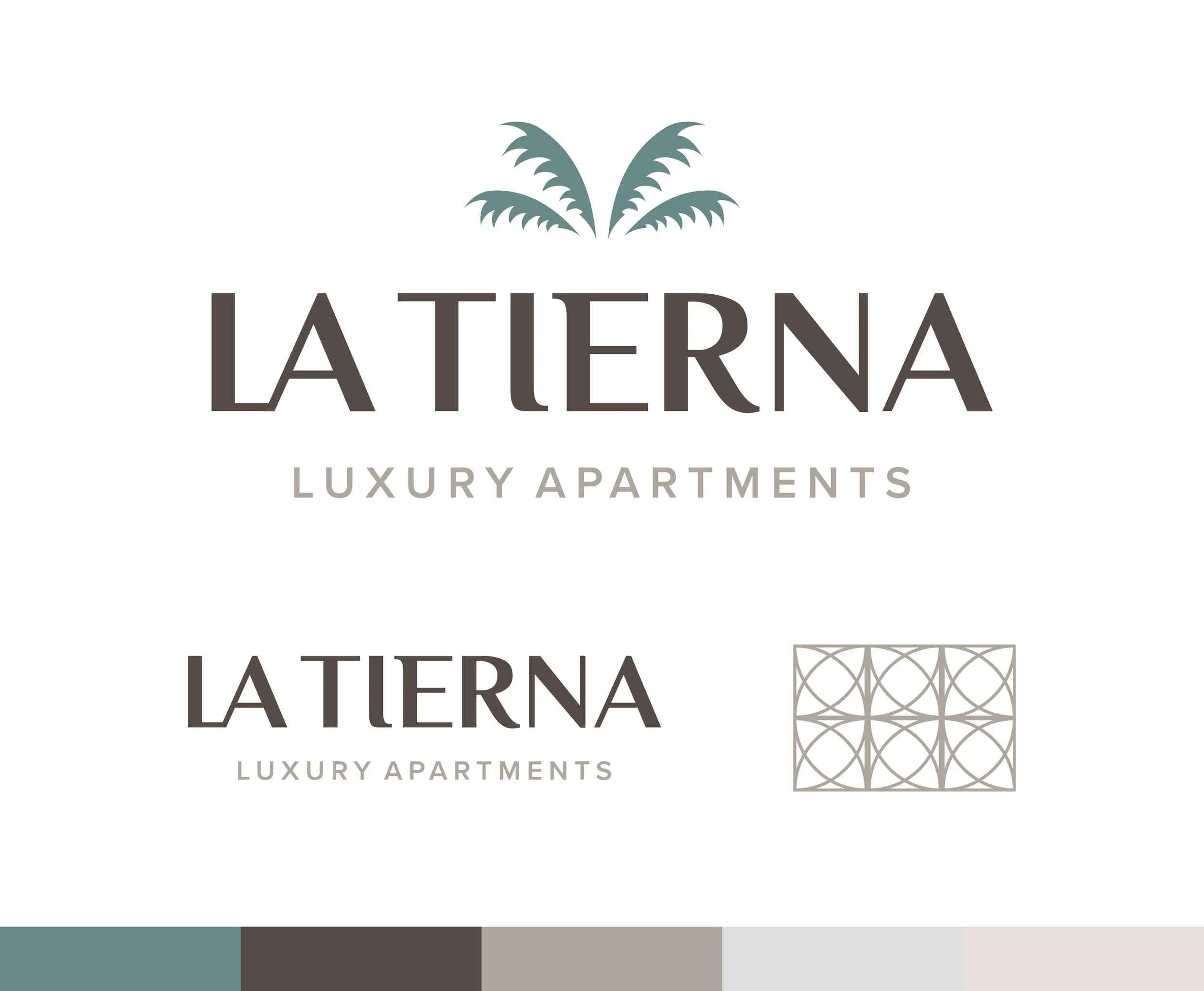
Vibrant / Sharp / Escape
The logo lockup has two distinct parts: a depiction of palm trees that envelop the community and a wordmark evoking prestige and opulence. The color palette emulates the luminosity of San Antonio and the chill that makes La Tierna special.
Concept 3: Heritage
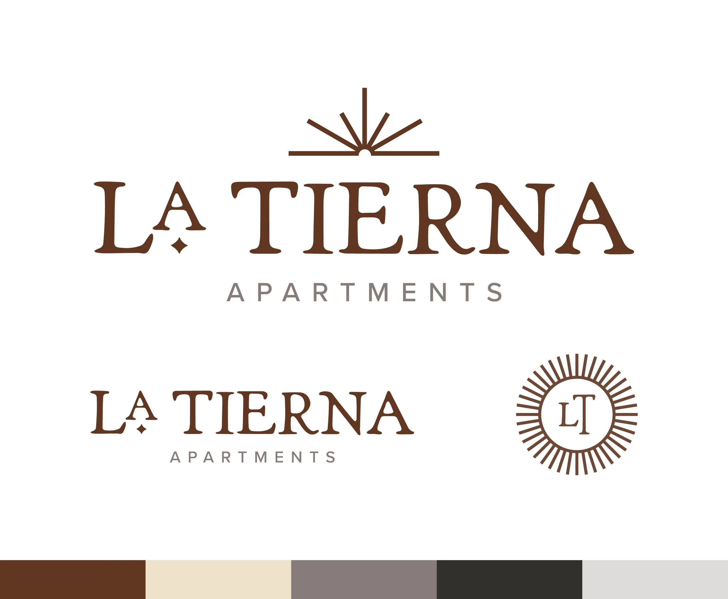
Warm / Natural / Sophisticated
This concept breathes Spanish inspiration and expresses the south-central spirit of San Antonio. The logomark is a sun graphic radiating warmth and energy with a serif-type emoting a natural and organic ambiance with rougher edges. This concept delivers a warm, resort sentiment of coming home to a sophisticated and affectionate atmosphere.
Phase 2B: Final Logo
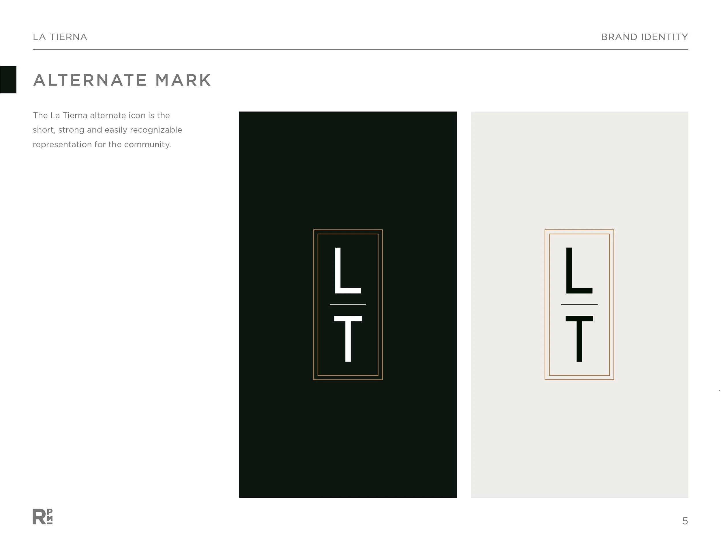
After presenting the concepts and implementing the client’s feedback, the new logo for La Tierna was ready to be finalized and ready for immediate use.
Phase 3: Brand Guide
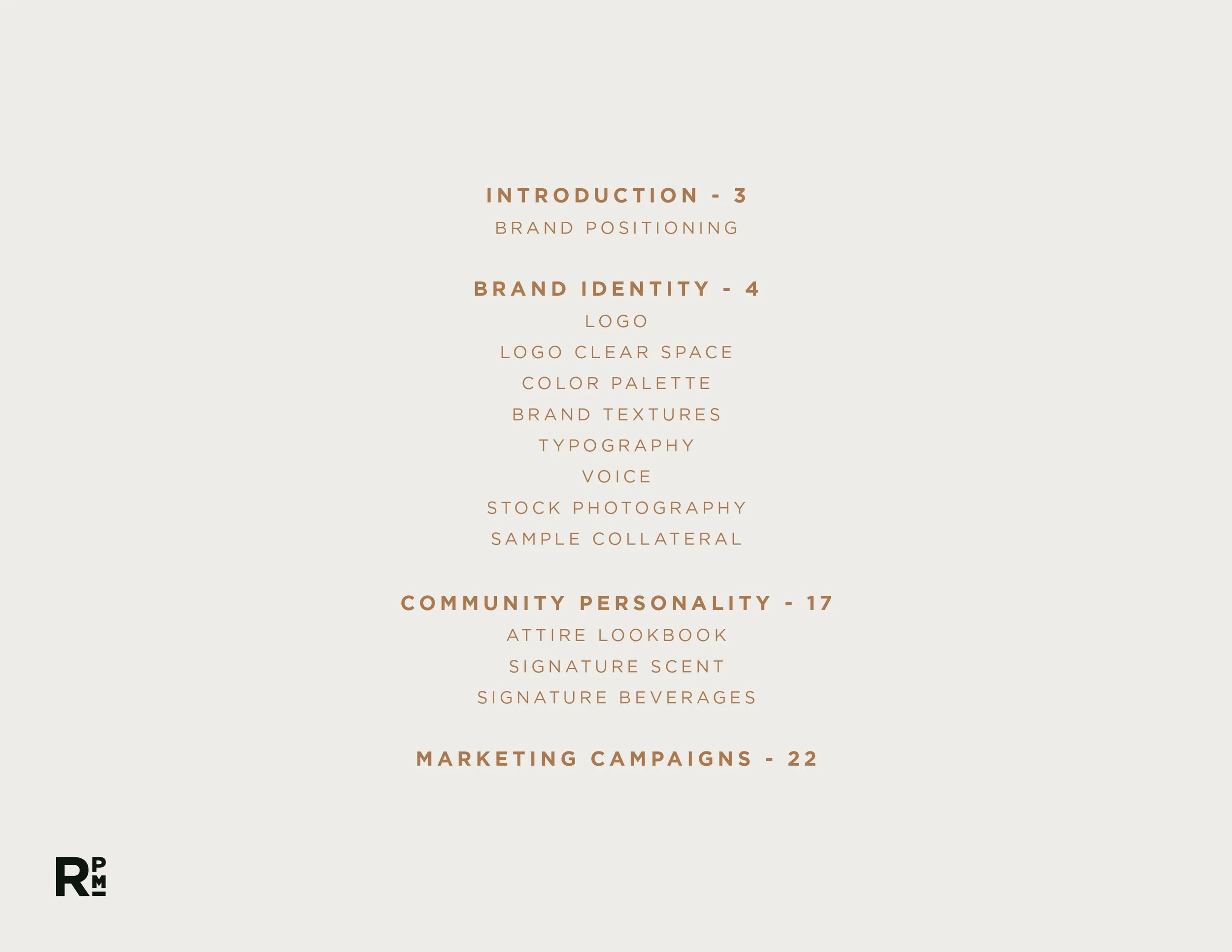
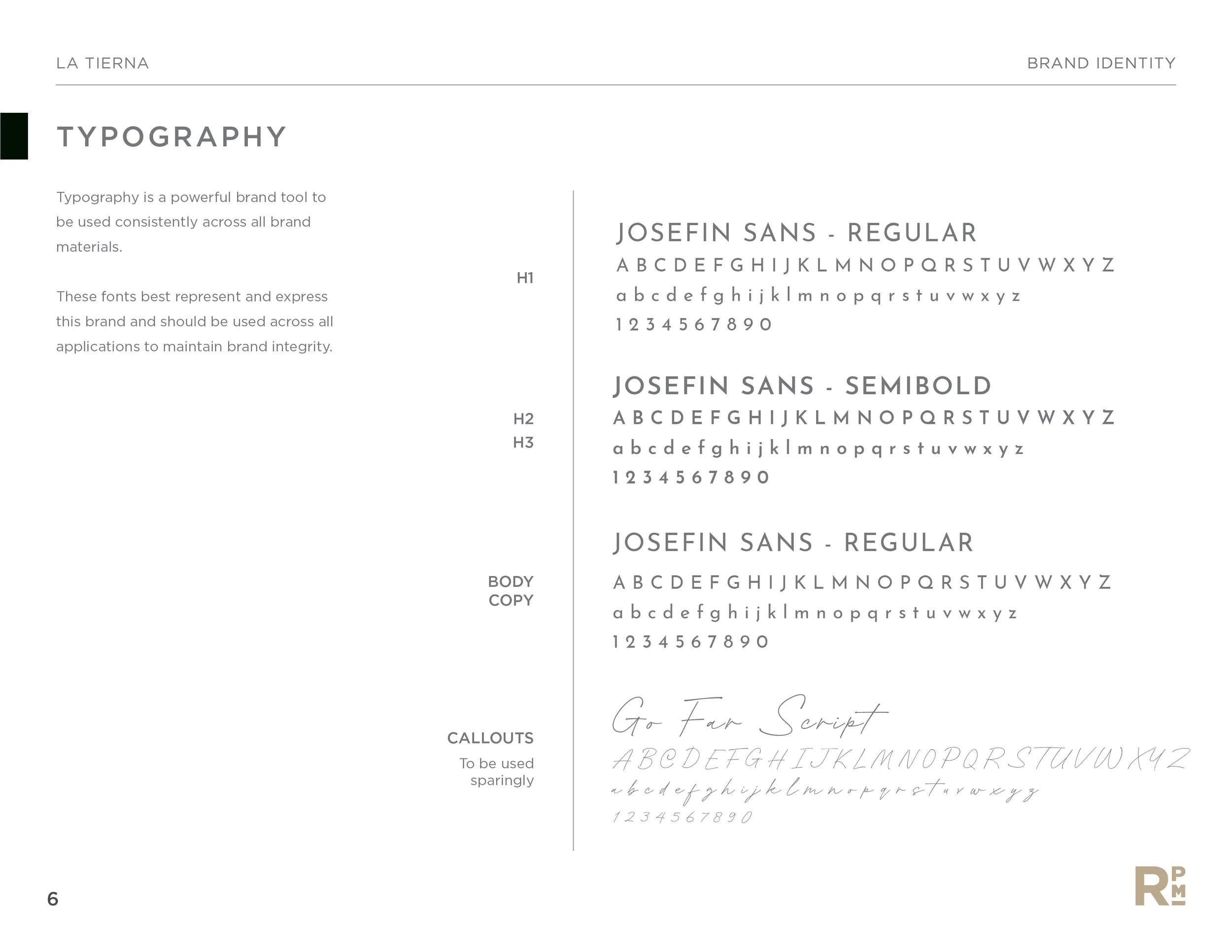
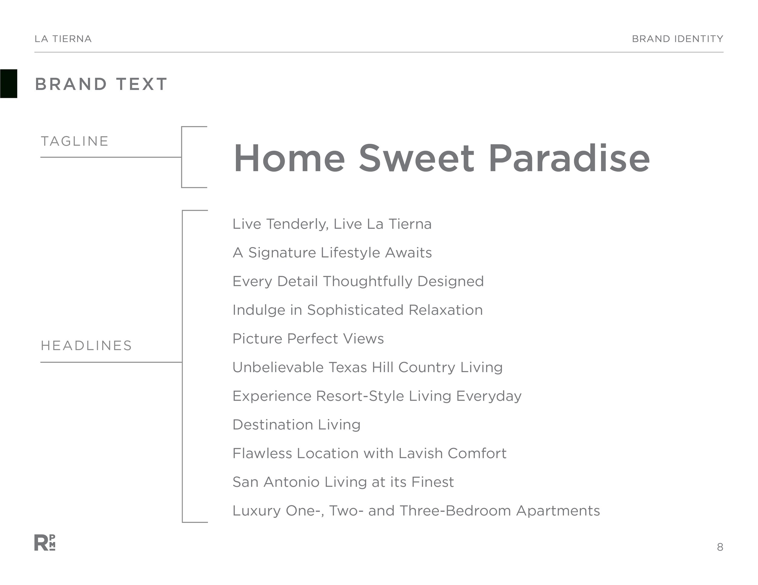
The next phase for this rebrand was to create a brand guide for brand usage. Additionally, this guide includes all brand elements, text, stock photography, and sample collateral for application guidance. Below is a sample of the brand guide.
Final Phase: Collateral
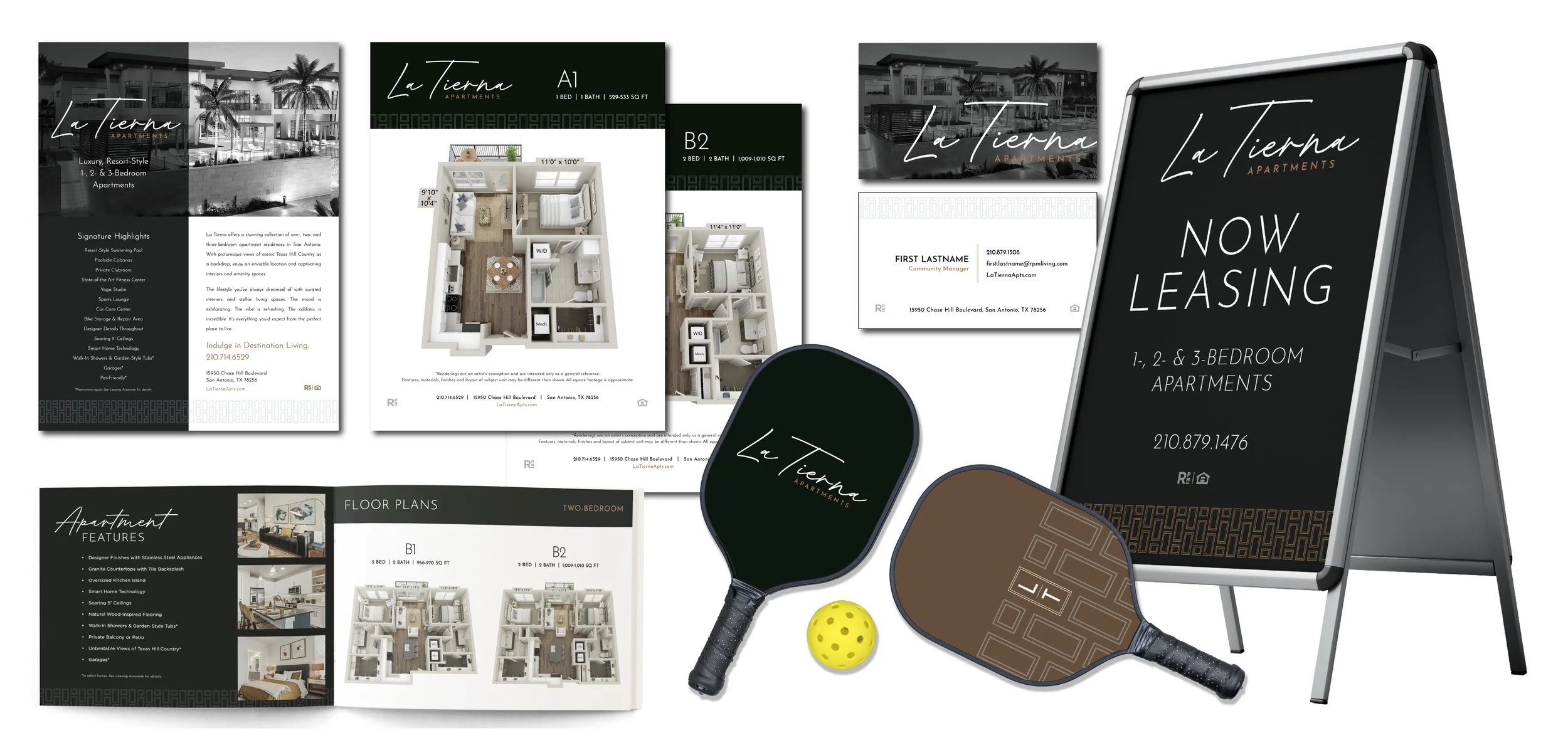
This rebrand included a suite of onsite leasing collateral to help direct and inform, drive traffic, and to lease.

